关键字
sass + classnames- CSS in JS
css moduletailwind
sass + classnames
安装
1
2
| cnpm install --save sass
cnpm install classnames
|
介绍
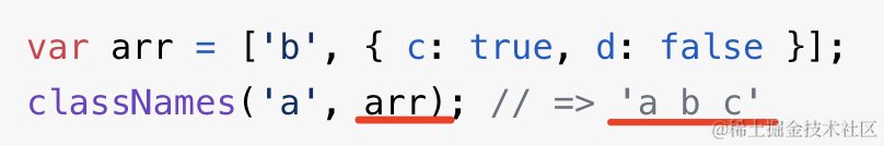
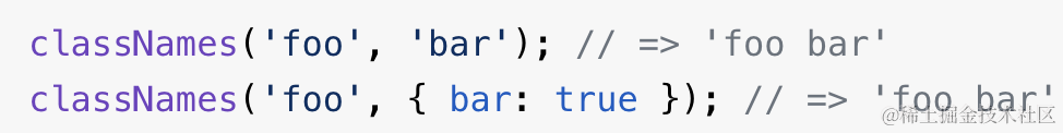
当 className 的确定需要一段复杂计算逻辑的时候,就用 classnames 这个包。
使用
1
2
3
4
5
6
7
8
9
10
11
12
13
14
15
16
17
18
19
20
21
22
23
24
25
26
27
28
29
30
31
| .calendar-month {
&-body {
&-row {
height: 100px;
display: flex;
}
&-cell {
flex: 1;
border: 1px solid #eee;
color: #ccc;
overflow: hidden;
&-current {
color: #000;
}
&-date {
padding: 10px;
&-selected {
background: blue;
width: 28px;
height: 28px;
line-height: 28px;
text-align: center;
color: #fff;
border-radius: 50%;
cursor: pointer;
}
}
}
}
}
|
1
2
3
4
5
6
| import cs from "classnames";
className={
cs("calendar-month-body-cell-date-value",
value?.format("YYYY-MM-DD") === item.date.format("YYYY-MM-DD")
? "calendar-month-body-cell-date-selected": ""
)}
|
styled-components
安装
1
| cnpm install --save styled-components
|
使用总和
1
2
3
4
5
6
7
8
9
10
11
12
13
14
15
16
17
18
19
20
21
22
23
24
25
26
27
28
29
30
31
32
33
34
35
36
37
38
39
40
41
42
43
44
45
46
47
48
49
50
51
52
53
54
55
56
57
58
59
60
61
62
63
64
65
66
67
68
69
70
71
72
73
74
75
76
77
78
79
80
81
82
83
84
85
86
87
88
89
90
91
92
93
94
95
96
97
98
99
100
101
102
103
104
105
106
107
108
109
110
111
112
113
114
115
116
117
118
119
120
121
122
123
124
125
126
127
128
129
130
131
132
133
134
135
136
137
138
139
140
141
142
143
144
145
| import { FC, PropsWithChildren, useState } from "react";
import styled, {
css,
keyframes,
RuleSet,
ThemeProvider,
useTheme,
} from "styled-components";
const Title = styled.h1`
font-size: 12px;
color: blue;
display: flex;
flex-direction: column;
`;
const Header = styled.div<{ color?: string }>`
padding: 30px;
background: ${(props) => props.color || "blue"};
`;
const Header2 = styled(Header)`
border-radius: 12px;
font-size: 30px;
background: ${(props) => (props.theme.dark ? "black" : "#ccc")};
&:hover {
color: red;
}
&::before {
content: "* ";
}
`;
interface LinkProps extends PropsWithChildren {
href: string;
className?: string;
}
const Link: FC<LinkProps> = ({ href, children, className }) => {
return (
<a href={href} className={className}>
{children}
</a>
);
};
const StyledLink = styled(Link).attrs<{ $color?: string }>((props) => {
console.log(props);
return {
$color: "orange",
children: props.children + " 光",
};
})`
color: ${(props) => props.$color || "green"};
font-size: 40px;
`;
const rotate = keyframes`
from {
transform: rotate(0deg);
}
to {
transform: rotate(360deg);
}
`;
const animation = css`
animation: ${rotate} 2s linear infinite;
`;
const Rotate = styled.div<{ $duration: number; otherStyles?: RuleSet }>`
display: inline-block;
font-size: 50px;
padding: 30px;
${animation}
${(props) => props.otherStyles};
`;
function Content() {
const theme = useTheme();
const [dark, setDark] = useState<boolean>(theme.dark);
return (
<>
<button
onClick={() => setDark(!dark)}
style={{
display: "flex",
justifyContent: "center",
alignItems: "center",
}}
>
切换
</button>
<ThemeProvider theme={{ dark }}>
<Header2></Header2>
</ThemeProvider>
</>
);
}
function App() {
return (
<>
<Title>
<Header2 color="yellow" as="span">
aaaaaaaa
</Header2>
<StyledLink href="#aaa" $color="blue">
Click me
</StyledLink>
</Title>
<Rotate
$duration={3}
otherStyles={[
{ border: "1px solid", background: "pink" },
{ boxShadow: "0 0 3px blue" },
]}
>
X
</Rotate>
<ThemeProvider theme={{ dark: true }}>
<Content />
</ThemeProvider>
</>
);
}
export default App;
|
使用
1
2
3
4
5
6
7
8
9
10
11
12
13
14
15
16
17
18
19
20
21
22
23
| import { styled } from 'styled-components';
const Title = styled.h1`
font-size: 30px;
text-align: center;
color: blue;
`;
const Header = styled.div`
padding: 20px;
background: pink;
`;
function App() {
return <Header>
<Title>
Hello World!
</Title>
</Header>
}
export default App
|
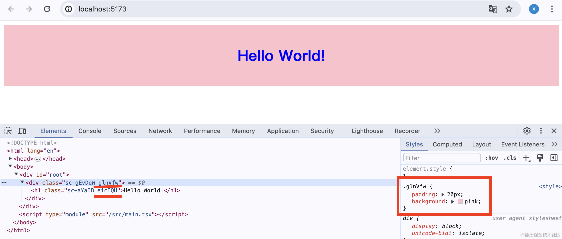
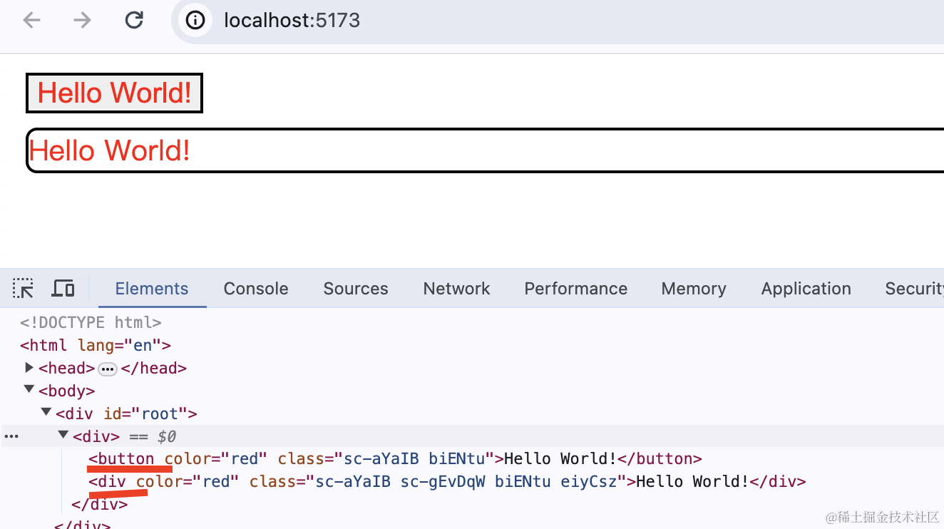
styled.div、styled.h1 会创建对应的标签,然后样式会生成一个唯一的 className。
所以说,用 styled-components 不用担心样式冲突的问题。
继续看,styled-components 的 styled.xx 可以作为组件用,那自然是可以传参的:
传参
1
2
3
4
5
6
7
8
9
10
11
12
13
14
15
16
17
18
19
20
21
22
23
24
25
26
27
28
29
| import { styled } from 'styled-components';
const Title = styled.h1<{ color?: string; }>`
font-size: 30px;
text-align: center;
color: ${props => props.color || 'blue'}
`;
const Header = styled.div`
padding: 20px;
background: pink;
`;
function App() {
return <Header>
<Title>
Hello World!
</Title>
<Title color='green'>
Hello World!
</Title>
<Title color='black'>
Hello World!
</Title>
</Header>
}
export default App
|
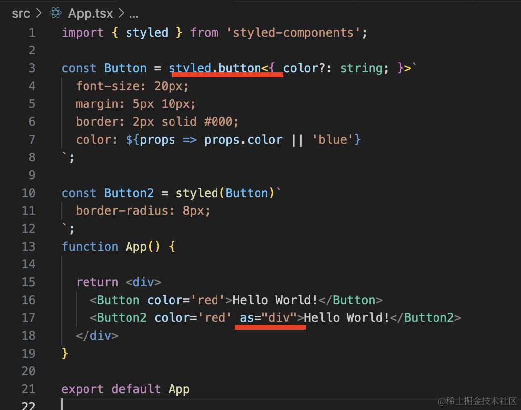
样式组件扩展样式
有的时候,样式需要基于已有的做扩展,比如我有一个 Button 的样式,另一种 Button 和它大部分一样,但有所不同。
1
2
3
4
5
6
7
8
9
10
11
12
13
14
15
16
17
18
19
20
21
| import { styled } from 'styled-components';
const Button = styled.button<{ color?: string; }>`
font-size: 20px;
margin: 5px 10px;
border: 2px solid #000;
color: ${props => props.color || 'blue'}
`;
const Button2 = styled(Button)`
border-radius: 8px;
`;
function App() {
return <div>
<Button color='red'>Hello World!</Button>
<Button2 color='red'>Hello World!</Button2>
</div>
}
export default App
|
更改样式组件标签
如果你还想改样式组件的标签,可以用 as:
普通组件加上样式
1
2
3
4
5
6
7
8
9
10
11
12
13
14
15
16
17
18
19
20
21
22
23
24
25
26
27
28
29
30
| import { FC, PropsWithChildren } from 'react';
import { styled } from 'styled-components';
interface LinkProps extends PropsWithChildren {
href: string;
className?: string;
}
const Link: FC<LinkProps> = (props) => {
const {
href,
className,
children
} = props;
return <a href={href} className={className}>{children}</a>
}
const StyledLink = styled(Link)`
color: green;
font-size: 40px;
`;
function App() {
return <div>
<StyledLink href='#aaa'>click me</StyledLink>
</div>
}
export default App
|
比如我们给 Link 组件加上样式。
这里要注意,Link 组件必须接收 className 参数,因为 styled-components 会把样式放到这个 className 上:
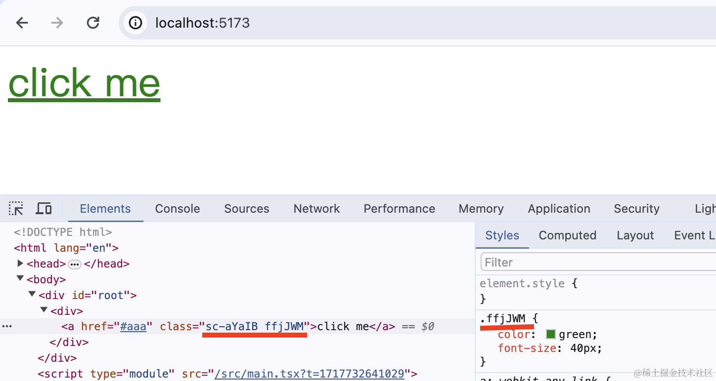
我们知道,样式组件也是可以接受参数的,为了区分两者,我们一般都是样式组件的 props 用 $ 开头:
1
2
3
4
5
6
7
8
9
10
| const StyledLink = styled(Link)<{ $color?: string;}>`
color: ${props => props.$color || 'green'};
font-size: 40px;
`;
function App() {
return <div>
<StyledLink href='#aaa' $color="purple">click me</StyledLink>
</div>
}
|
修改props
用 attrs 方法,接收传入的 props 返回修改后的 props。
1
2
3
4
5
6
7
8
9
10
11
12
13
14
15
16
17
18
19
20
21
22
23
24
25
26
27
28
29
30
31
32
33
34
35
36
37
38
| import { FC, PropsWithChildren } from 'react';
import { styled } from 'styled-components';
interface LinkProps extends PropsWithChildren {
href: string;
className?: string;
}
const Link: FC<LinkProps> = (props) => {
console.log(props);
const {
href,
className,
children
} = props;
return <a href={href} className={className}>{children}</a>
}
const StyledLink = styled(Link).attrs<{ $color?: string;}>((props) => {
console.log(props);
props.$color = 'orange';
props.children = props.children + ' 光';
return props;
})`
color: ${props => props.$color || 'green'};
font-size: 40px;
`;
function App() {
return <div>
<StyledLink href='#aaa' $color="purple">click me</StyledLink>
</div>
}
export default App
|
伪类、伪元素选择器
1
2
3
4
5
6
7
8
9
10
11
12
13
14
15
16
17
18
19
20
21
22
23
| import { styled } from 'styled-components';
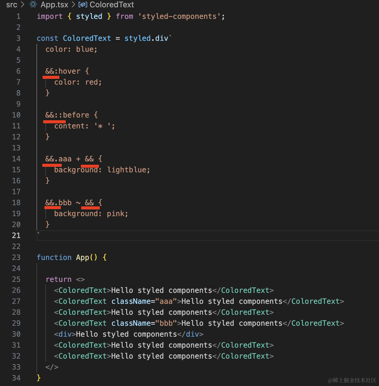
const ColoredText = styled.div`
color: blue;
&:hover {
color: red;
}
&::before {
content: '* ';
}
`
function App() {
return <>
<ColoredText>Hello styled components</ColoredText>
</>
}
export default App;
|
但 styled components 这个 & 和 scss 里的 & 含义还不大一样。
它指的是同一个样式组件的实例,这里也就是 ColoredText 的实例。
所以可以这样写:
1
2
3
4
5
6
7
8
9
10
11
12
13
14
15
16
17
18
19
20
21
22
23
24
25
26
27
28
29
30
31
32
33
34
35
36
| import { styled } from 'styled-components';
const ColoredText = styled.div`
color: blue;
&:hover {
color: red;
}
&::before {
content: '* ';
}
&.aaa + & {
background: lightblue;
}
&.bbb ~ & {
background: pink;
}
`
function App() {
return <>
<ColoredText>Hello styled components</ColoredText>
<ColoredText className="aaa">Hello styled components</ColoredText>
<ColoredText>Hello styled components</ColoredText>
<ColoredText className="bbb">Hello styled components</ColoredText>
<div>Hello styled components</div>
<ColoredText>Hello styled components</ColoredText>
<ColoredText>Hello styled components</ColoredText>
</>
}
export default App;
|
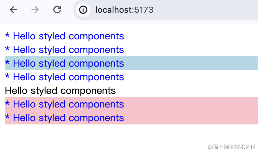
这里 &.aaa + & 就是 .aaa 的 ColoredText 样式组件之后的一个 ColoredText 样式组件实例。
&.bbb ~ & 就是 .bbb 的 ColoredText 样式组件之后的所有 ColoredText 样式组件实例。
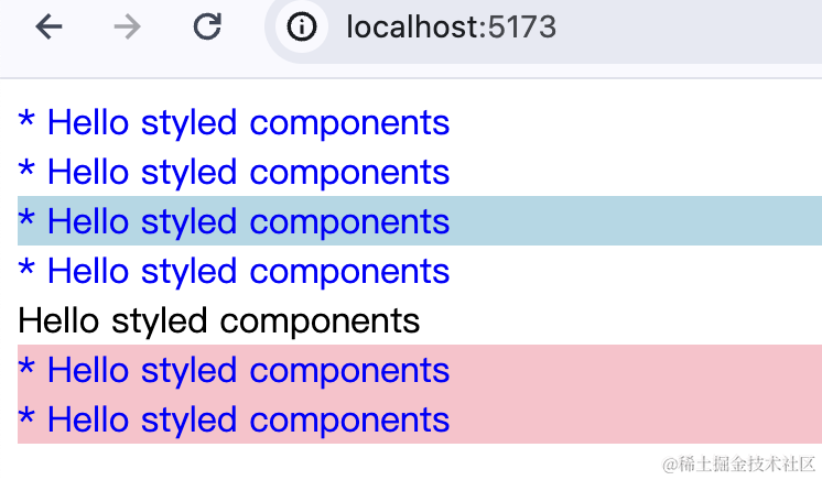
此外,如果你把 & 全换成 &&,你会发现效果也一样:
那什么时候用 &、什么时候用 && 呢?
当你和全局样式冲突的时候。
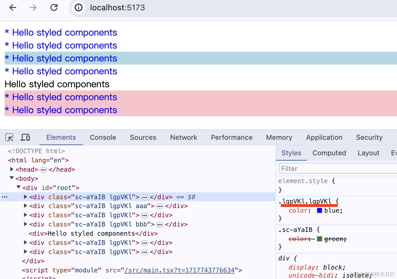
styled-components 用 createGlobalStyle 创建全局样式:
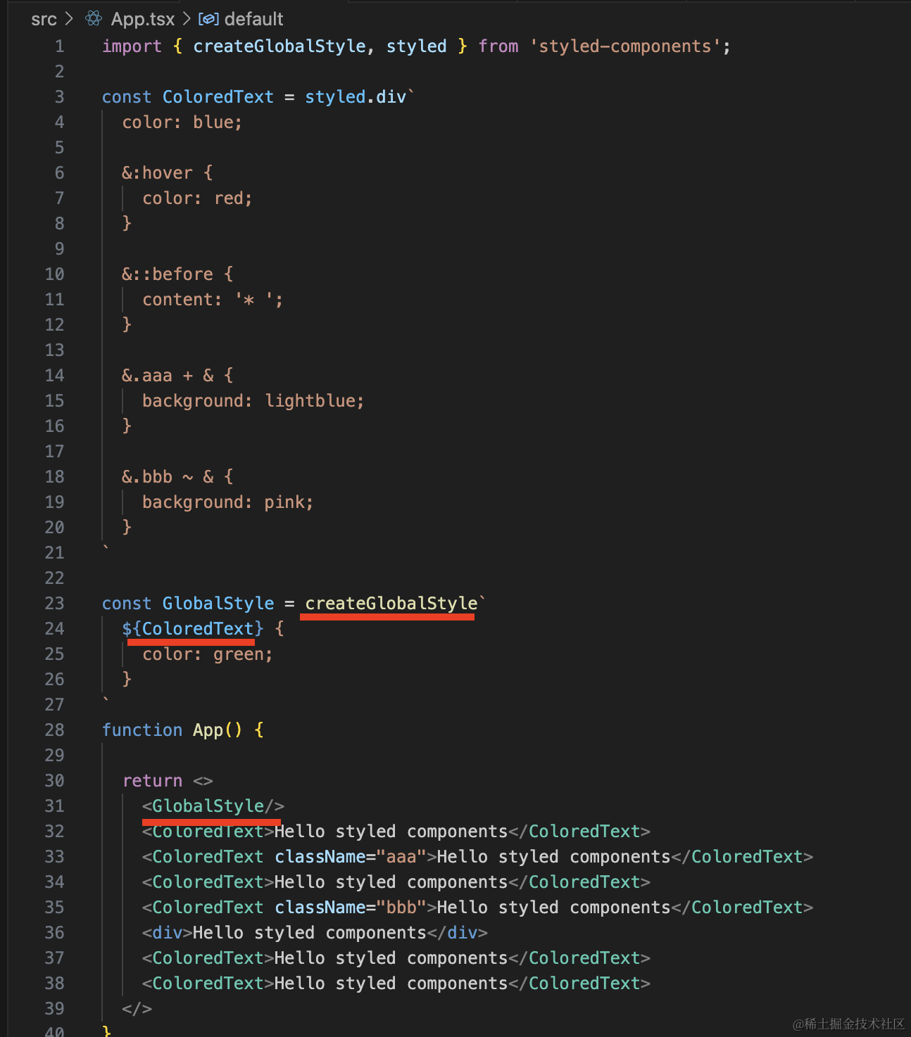
我们全局指定 ColoredText 的 color 为 green,然后组件里指定 color 为 blue。
看下效果:
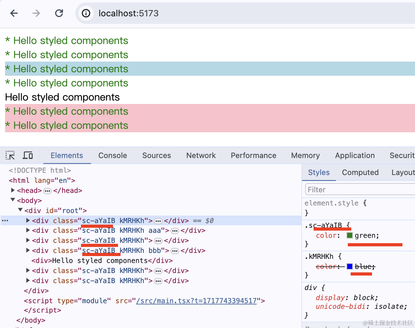
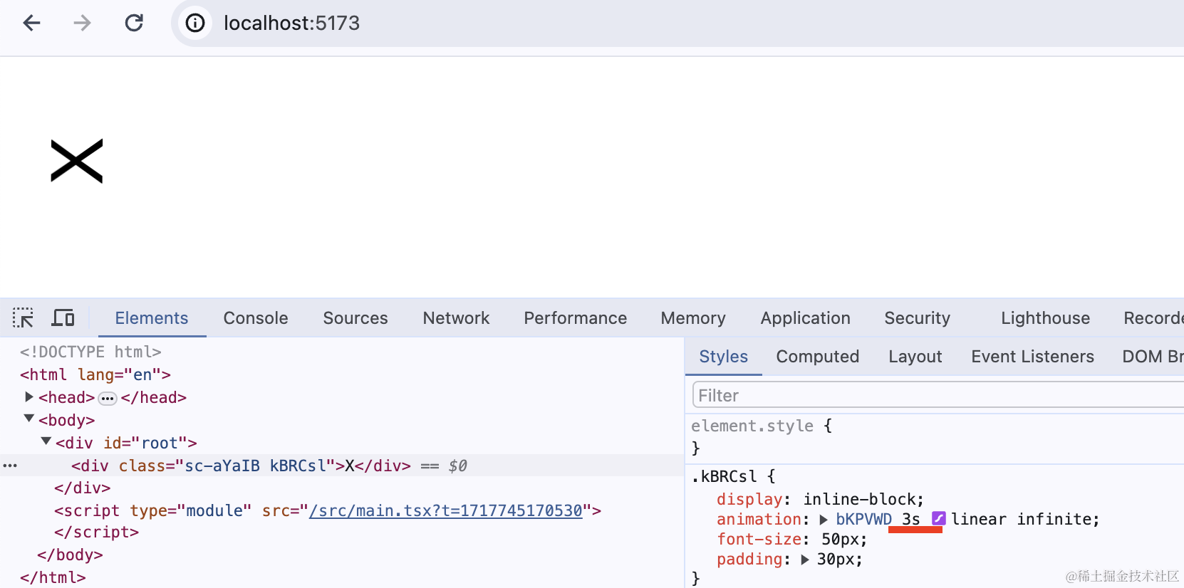
每个 ColorText 组件都会有一个 src-aYaIB 的 className,全局样式就是给这个 className 加了 color 为 green 的样式。
可以看到,组件里写的 color: blue 被覆盖了。
这时候你这样写是没用的:
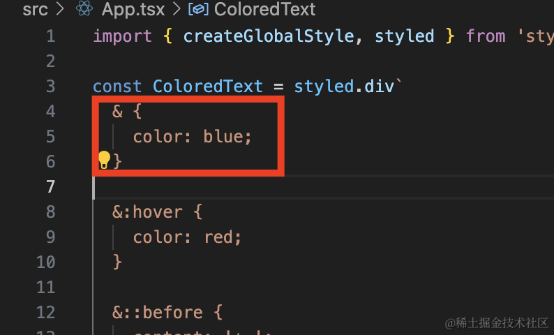
用 && 才能覆盖:
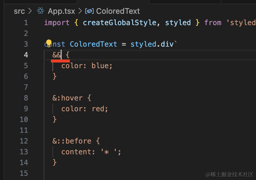
它通过 .aaa.aaa 这样的方式实现了样式优先级的提升:
动画
1
2
3
4
5
6
7
8
9
10
11
12
13
14
15
16
17
18
19
20
21
22
23
24
25
| import { styled, keyframes } from 'styled-components';
const rotate = keyframes`
from {
transform: rotate(0deg);
}
to {
transform: rotate(360deg);
}
`;
const Rotate = styled.div`
display: inline-block;
animation: ${rotate} 2s linear infinite;
font-size: 50px;
padding: 30px;
`;
function App() {
return <Rotate>X</Rotate>
}
export default App;
|
此外,如果你想复用部分 css,要这样写:
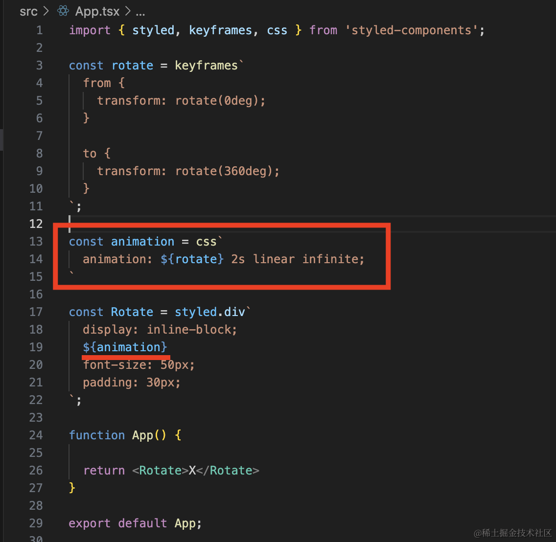
1
2
3
4
5
6
7
8
9
10
| const animation = css`
animation: ${rotate} 2s linear infinite;
`
const Rotate = styled.div`
display: inline-block;
${animation}
font-size: 50px;
padding: 30px;
`;
|
不加 css 是不会生效的,你可以试一下。
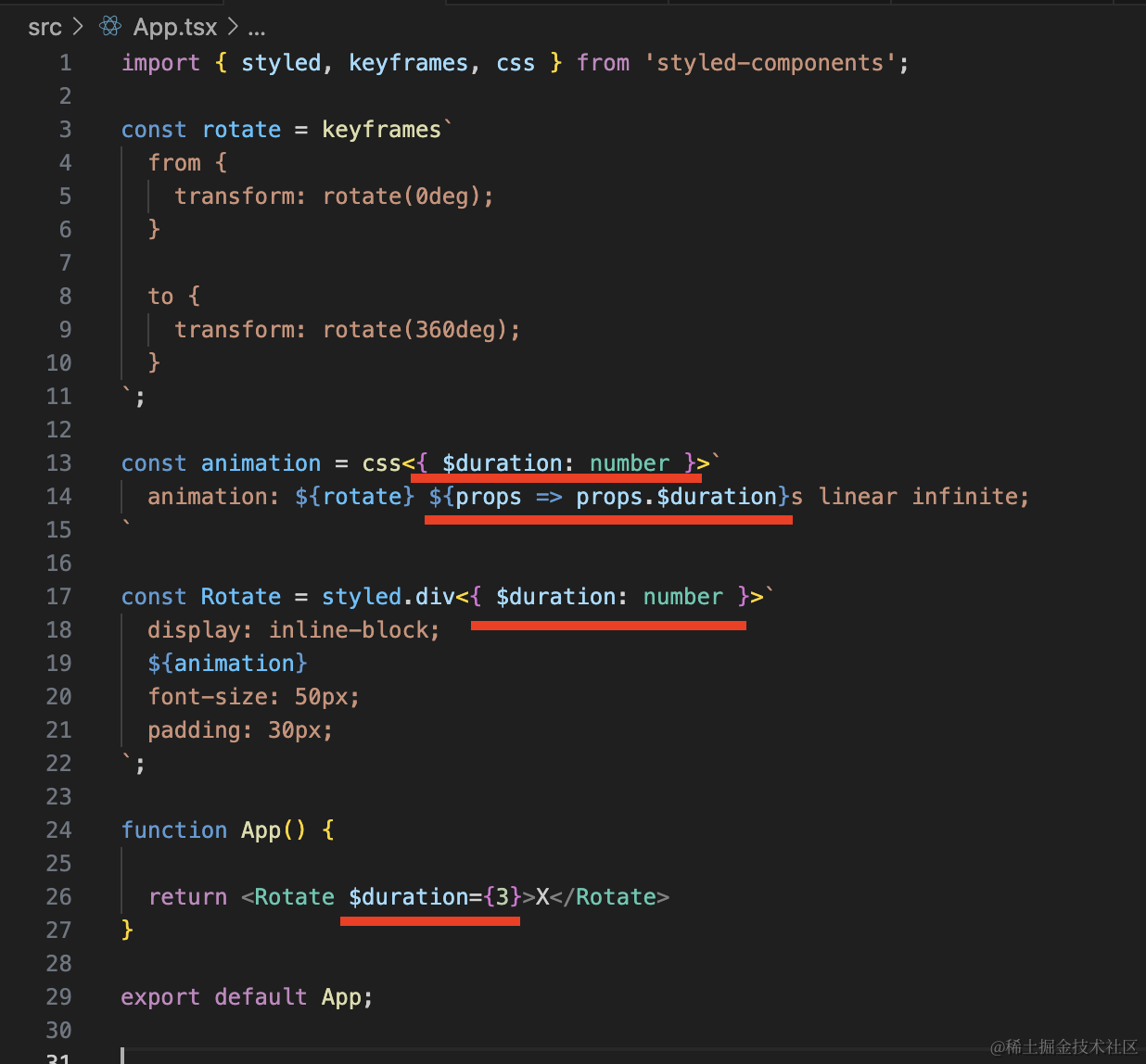
抽出来的 css 也是可以用 props 的:
1
2
3
4
5
6
7
8
9
10
11
12
13
14
15
16
17
18
19
20
21
22
23
24
25
26
27
28
29
| import { styled, keyframes, css } from 'styled-components';
const rotate = keyframes`
from {
transform: rotate(0deg);
}
to {
transform: rotate(360deg);
}
`;
const animation = css<{ $duration: number }>`
animation: ${rotate} ${props => props.$duration}s linear infinite;
`
const Rotate = styled.div<{ $duration: number }>`
display: inline-block;
${animation}
font-size: 50px;
padding: 30px;
`;
function App() {
return <Rotate $duration={3}>X</Rotate>
}
export default App;
|
但是 css 声明了类型,用到了这部分样式的 styled.xxx 也需要声明类型。
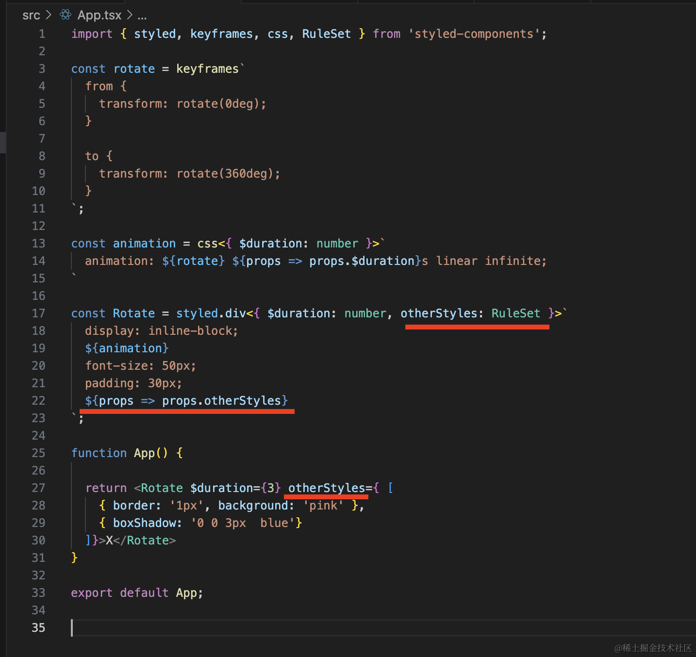
如果你希望样式组件用的时候可以传入一些样式,那可以用 RuleSet:
1
2
3
4
5
6
7
8
9
10
11
12
13
14
15
16
17
18
19
20
21
22
23
24
25
26
27
28
29
30
31
32
33
| import { styled, keyframes, css, RuleSet } from 'styled-components';
const rotate = keyframes`
from {
transform: rotate(0deg);
}
to {
transform: rotate(360deg);
}
`;
const animation = css<{ $duration: number }>`
animation: ${rotate} ${props => props.$duration}s linear infinite;
`
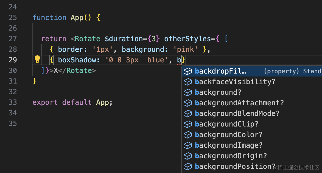
const Rotate = styled.div<{ $duration: number, otherStyles: RuleSet }>`
display: inline-block;
${animation}
font-size: 50px;
padding: 30px;
${props => props.otherStyles}
`;
function App() {
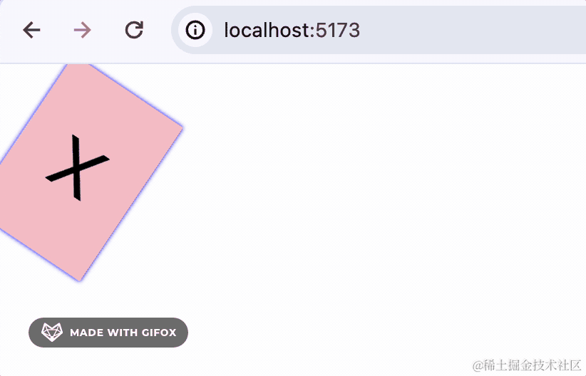
return <Rotate $duration={3} otherStyles={ [
{ border: '1px', background: 'pink' },
{ boxShadow: '0 0 3px blue'}
]}>X</Rotate>
}
export default App;
|
它是一个样式对象的数组类型:
可以用的时候传入一些样式:
theme
1
2
3
4
5
6
7
8
9
10
11
12
13
14
15
16
17
18
| import { styled, ThemeProvider } from 'styled-components';
const Aaa = styled.div`
width: 100px;
height: 100px;
background: ${props => props.theme.dark ? 'black' : '#ccc'}
`
function Content() {
return <Aaa></Aaa>
}
function App() {
return <ThemeProvider theme={{ dark: true }}>
<Content></Content>
</ThemeProvider>
}
export default App;
|
每个样式组件都有 props.theme 可以读取当前 theme 对象,然后这个对象可以通过 useTheme 读取,通过 ThemeProvider 修改。
1
2
3
4
5
6
7
8
9
10
11
12
13
14
15
16
17
18
19
20
21
22
23
24
25
26
27
| import { useState } from 'react';
import { styled, ThemeProvider, useTheme } from 'styled-components';
const Aaa = styled.div`
width: 100px;
height: 100px;
background: ${props => props.theme.dark ? 'black' : '#ccc'}
`
function Content() {
const theme = useTheme();
const [dark, setDark] = useState<boolean>(theme.dark);
return <>
<button onClick={() => setDark(!dark)}>切换</button>
<ThemeProvider theme={{ dark }}>
<Aaa></Aaa>
</ThemeProvider>
</>
}
function App() {
return <ThemeProvider theme={{ dark: true }}>
<Content></Content>
</ThemeProvider>
}
export default App;
|
我们用 useTheme 读取了当前 theme,然后点击按钮的时候 setState 触发重新渲染,通过 ThemeProvider 修改了 theme 的值。
这就是 styled-components 的 theme 功能。
css module
引言
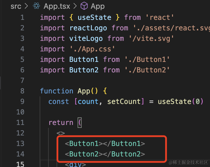
添加两个组件 Button1、Button2
Button1.tsx
1
2
3
4
5
6
7
| import './Button1.css';
export default function() {
return <div className='btn-wrapper'>
<button className="btn">button1</button>
</div>
}
|
Button1.css
1
2
3
4
5
6
7
| .btn-wrapper {
padding: 20px;
}
.btn {
background: blue;
}
|
Button2.tsx
1
2
3
4
5
6
7
| import './Button2.css';
export default function() {
return <div className='btn-wrapper'>
<button className="btn">button2</button>
</div>
}
|
Button2.css
1
2
3
4
5
6
7
| .btn-wrapper {
padding: 10px;
}
.btn {
background: green;
}
|
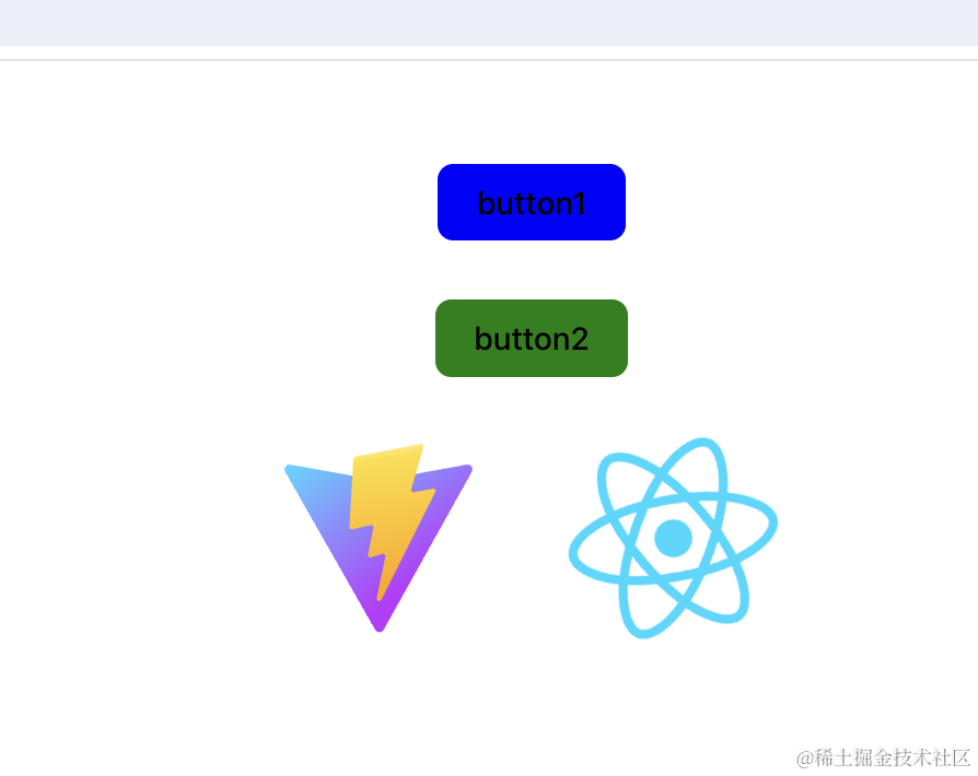
在 App.tsx 引入下:
渲染出来是这样的:
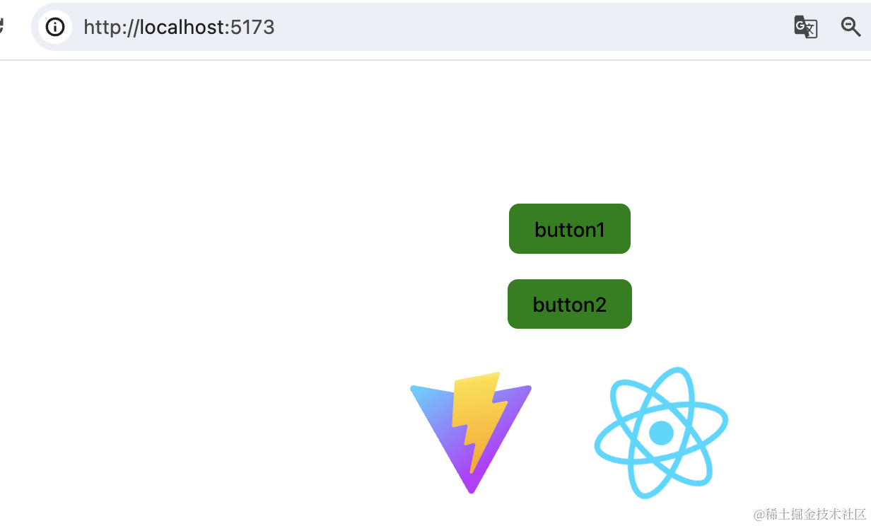
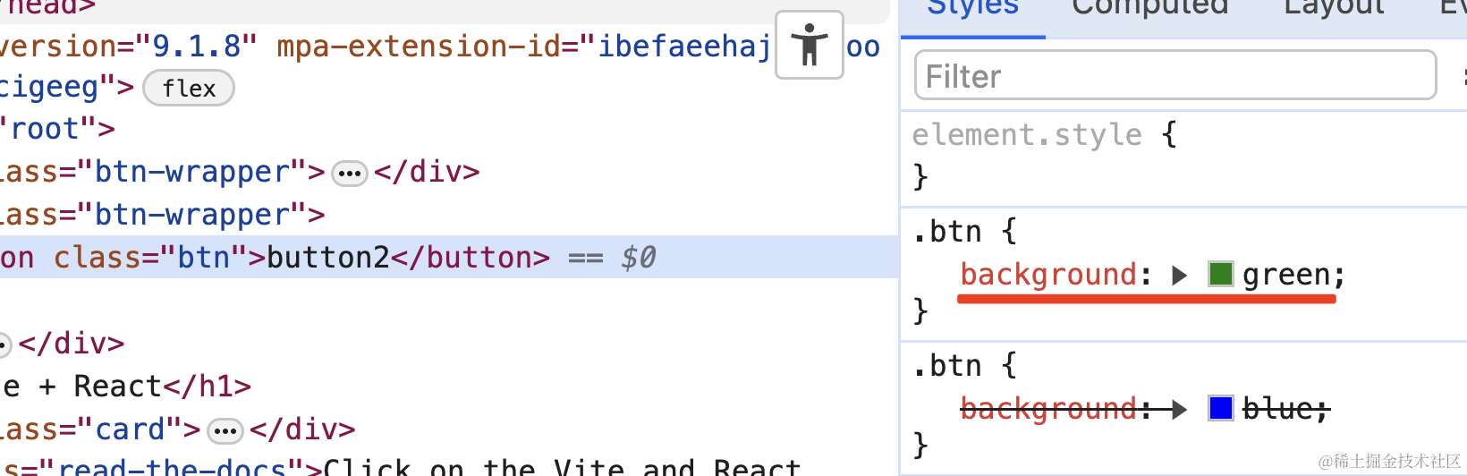
很明显,是样式冲突了:
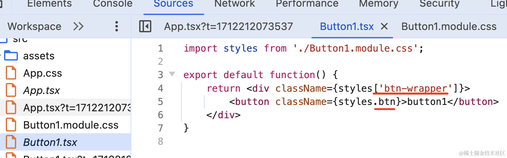
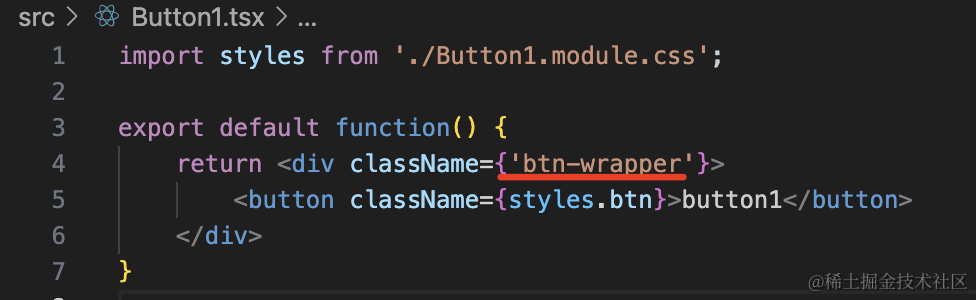
这时候可以改下名字,把 Button1.css 该为 Button1.module.css
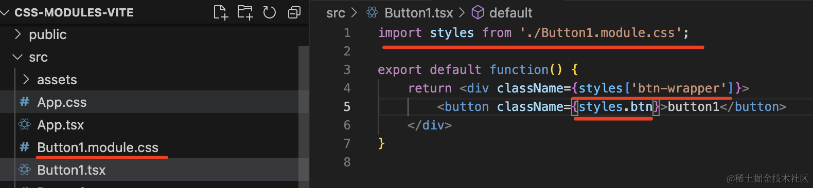
并且改下写 className 的方式。
1
2
3
4
5
6
7
| import styles from './Button1.module.css';
export default function() {
return <div className={styles['btn-wrapper']}>
<button className={styles.btn}>button1</button>
</div>
}
|
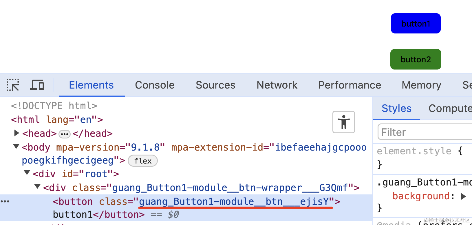
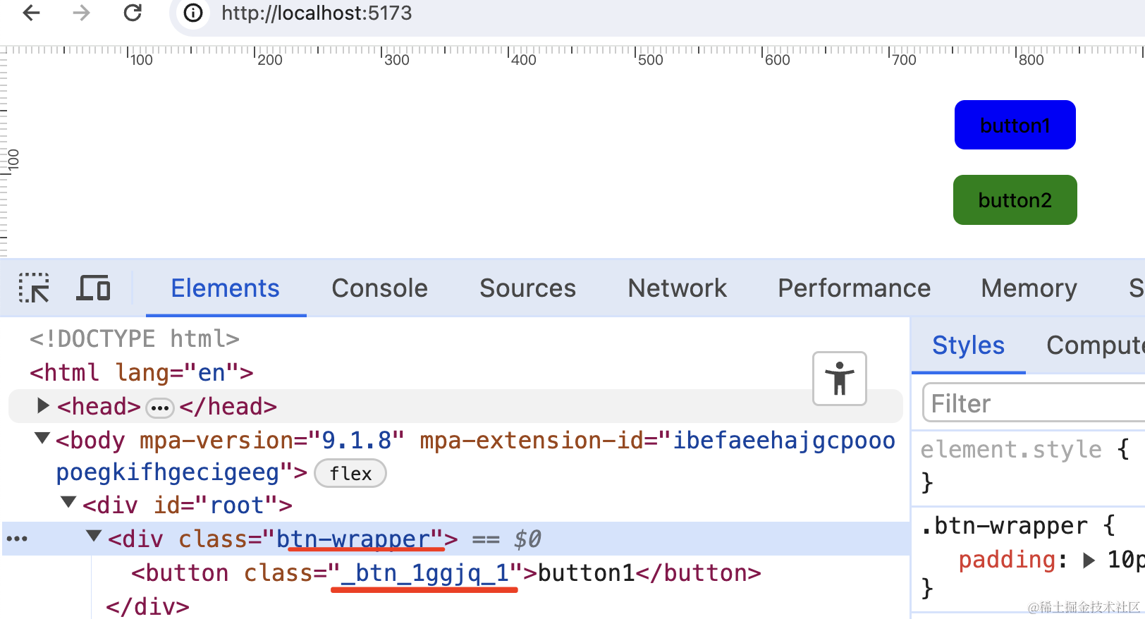
在浏览器看下:
现在就不会样式冲突了。
为什么呢?
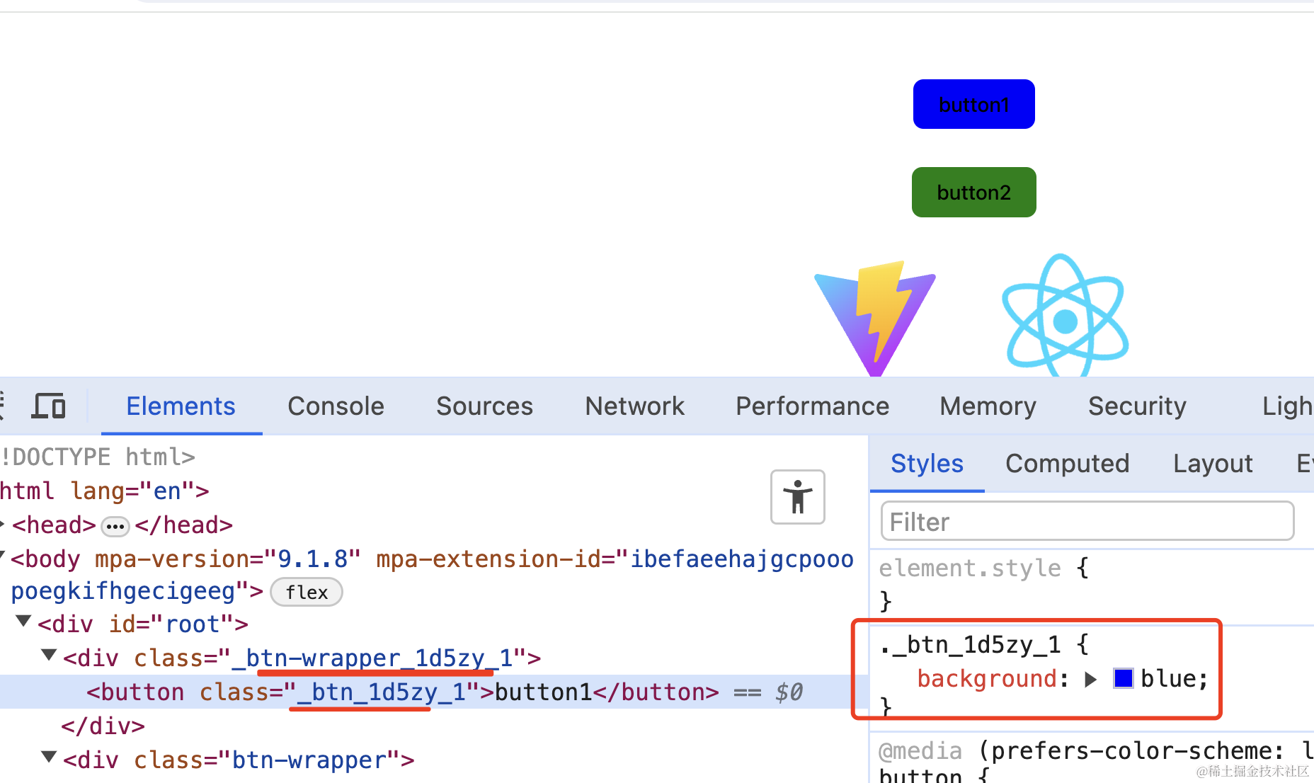
可以看到,button1 的 className 变成了带 hash 的形式,全局唯一的,自然就不会冲突了。
这就是 css modules。
原理
那它是怎么实现的呢?
看下编译后的代码就明白了:
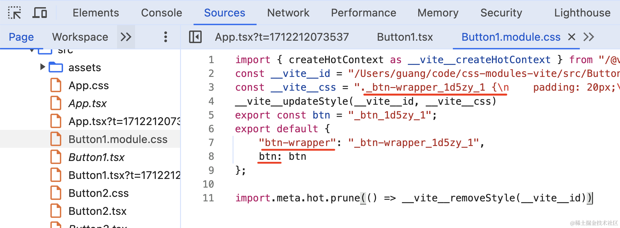
它通过编译给 className 加上了 hash,然后导出了这个唯一的 className。
所以在对象里用的,就是编译后的 className:
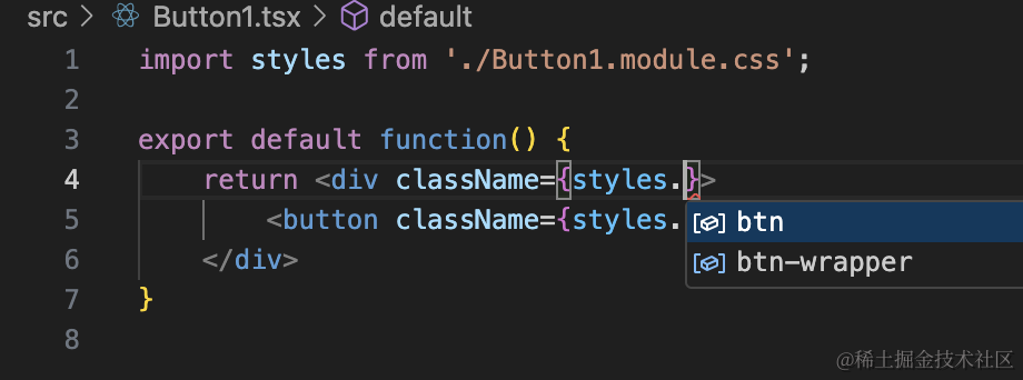
在 vscode 里安装 css modules 插件:
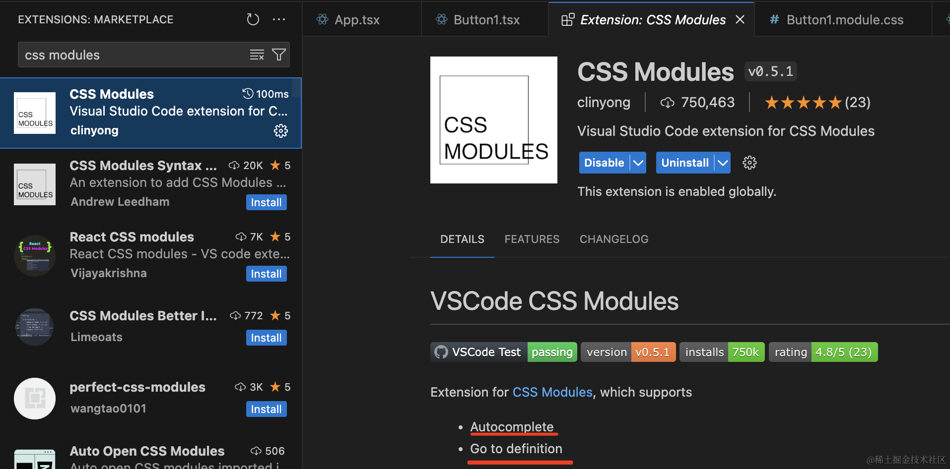
就可以提示出 css 模块下的 className 了:
使用
- 将
css改为.moule.css后缀
- 将className改为
className={styles["btn-wrapper"]或者className={styles.btn}
修改配置
我们可以在 vite.config.ts 里修改下 css modules 的配置:
1
2
3
4
5
6
7
8
9
10
11
12
13
| import { defineConfig } from 'vite'
import react from '@vitejs/plugin-react'
export default defineConfig({
plugins: [react()],
css: {
modules: {
generateScopedName: "guang_[name]__[local]___[hash:base64:5]"
}
}
})
|
比如通过 generateScopedName 来修改生成的 className 的格式:
全局样式
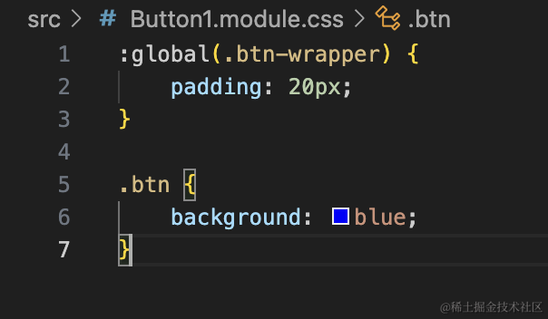
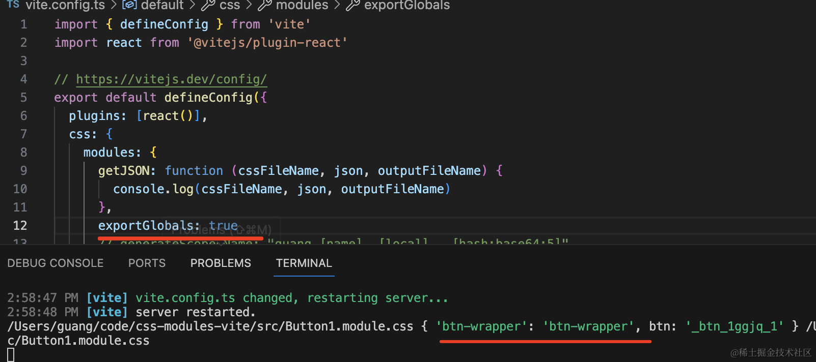
那如果在 Button1.module.css 里想把 .btn-wrapper 作为全局样式呢?
这样写:
可以看到,现在编译后的 css 里就没有对 .btn-wrapper 做处理了:
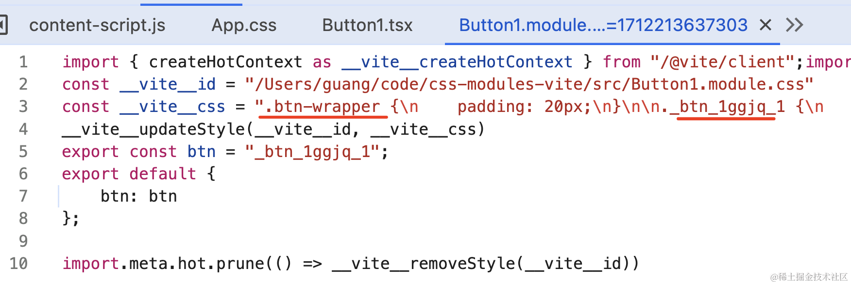
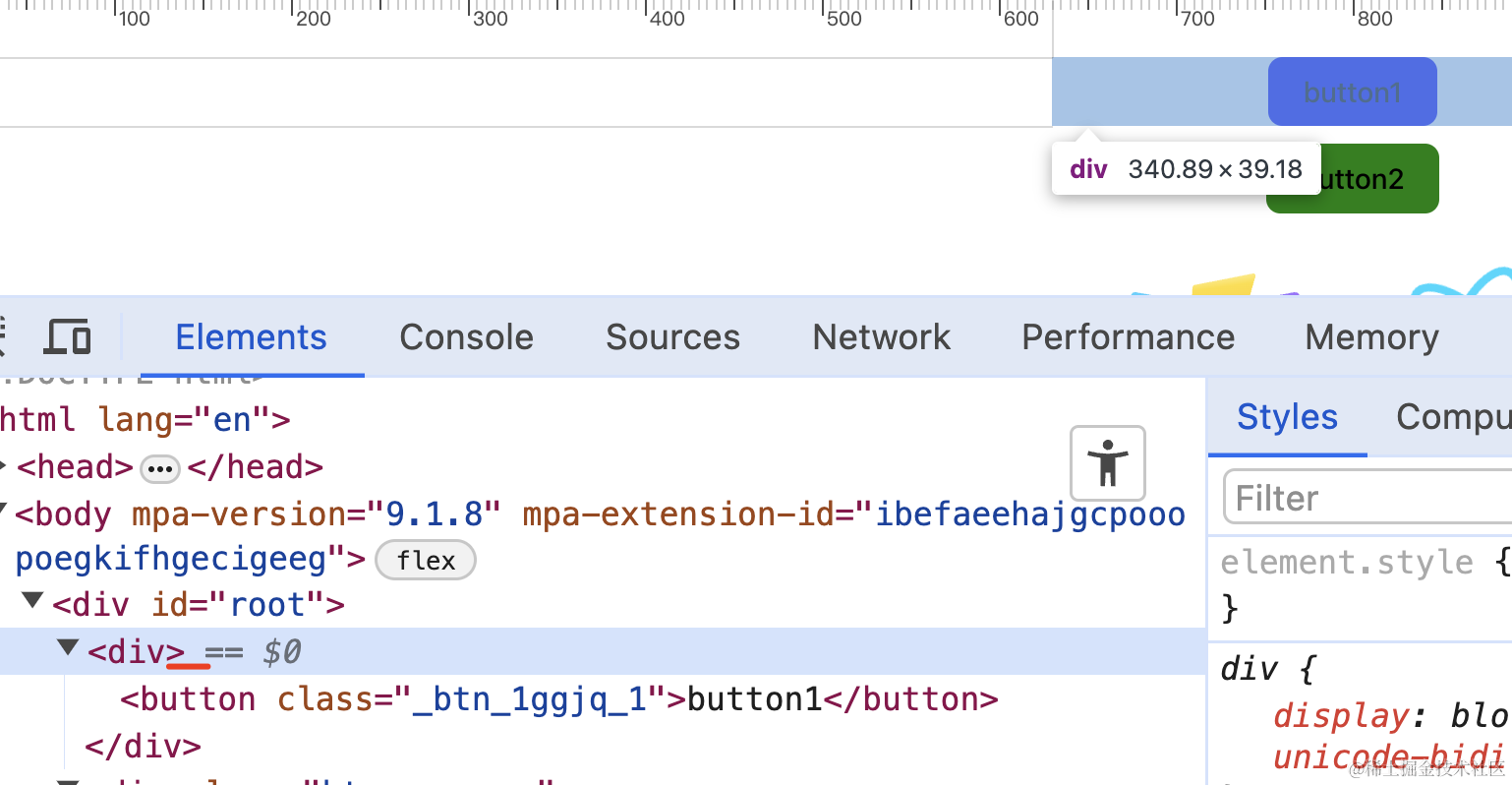
只不过,因为 global 的 className 默认不导出,而我们用 styles.xxx 引入的:
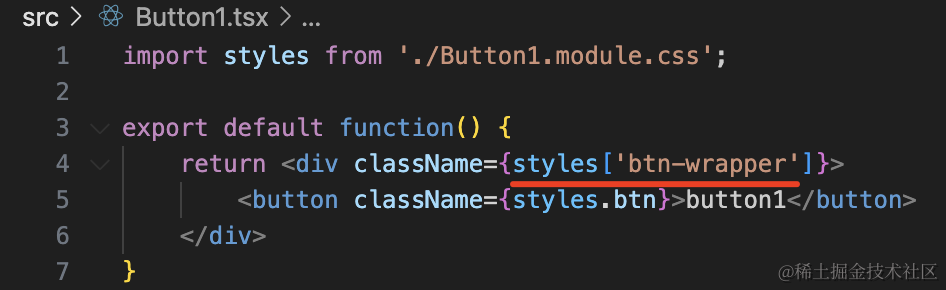
所以 className 为空:
这时候,或者把 className 改为这样:
或者在配置里加一个 exportsGlobals:true
1
2
3
4
5
6
7
8
9
10
11
12
13
14
15
16
| import { defineConfig } from 'vite'
import react from '@vitejs/plugin-react'
export default defineConfig({
plugins: [react()],
css: {
modules: {
getJSON: function (cssFileName, json, outputFileName) {
console.log(cssFileName, json, outputFileName)
},
exportGlobals: true
}
}
})
|
可以看到,现在 global 样式也导出了:
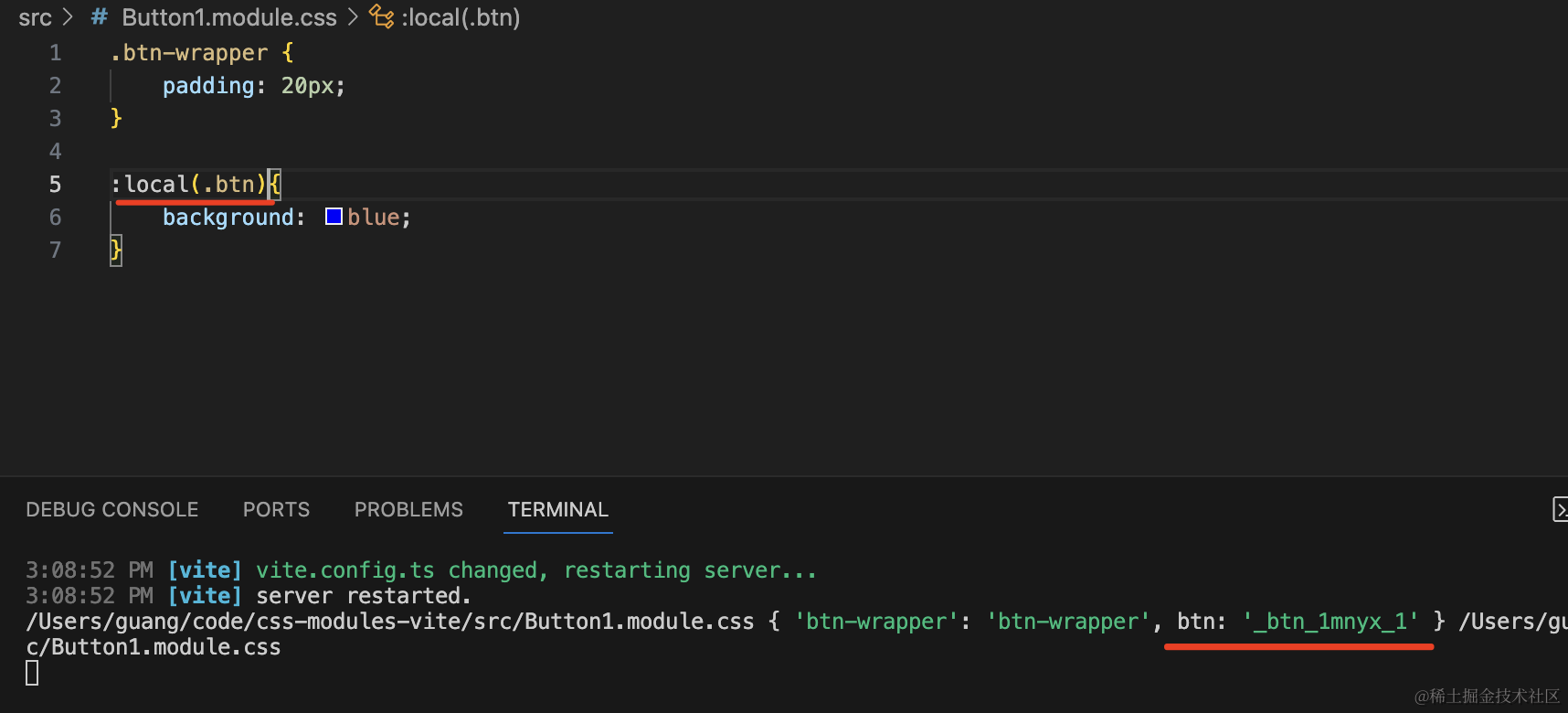
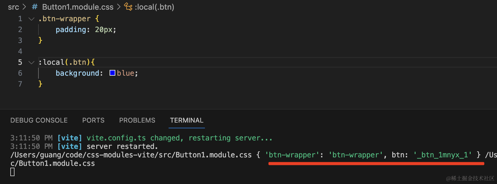
相对的,模块化的 className 就用 :local() 来声明:
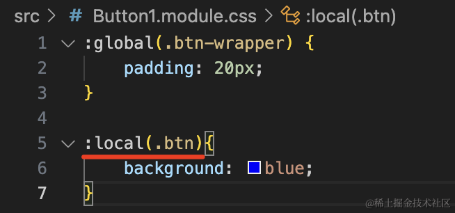
默认是 local。
如果你想默认 global,那也可以配置:
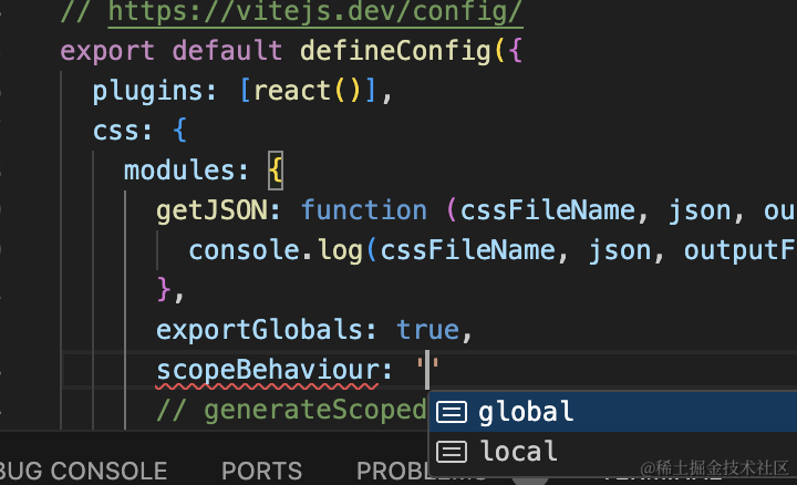
1
2
3
4
5
6
7
8
9
10
11
12
13
14
15
16
17
| import { defineConfig } from 'vite'
import react from '@vitejs/plugin-react'
export default defineConfig({
plugins: [react()],
css: {
modules: {
getJSON: function (cssFileName, json, outputFileName) {
console.log(cssFileName, json, outputFileName)
},
exportGlobals: true,
scopeBehaviour: 'global'
}
}
})
|
可以看到,现在就正好反过来了:
默认是 global,如果是 local 的要单独用 :local() 声明。
你还可以通过正则表达式来匹配哪些 css 文件是默认全局:
1
2
3
4
5
6
7
8
9
10
11
12
13
14
15
16
| import { defineConfig } from 'vite'
import react from '@vitejs/plugin-react'
export default defineConfig({
plugins: [react()],
css: {
modules: {
getJSON: function (cssFileName, json, outputFileName) {
console.log(cssFileName, json, outputFileName)
},
exportGlobals: true,
globalModulePaths: [/Button1/]
}
}
})
|
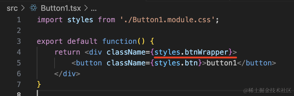
localsConvention
还有一个配置比较常用,就是 localsConvention:
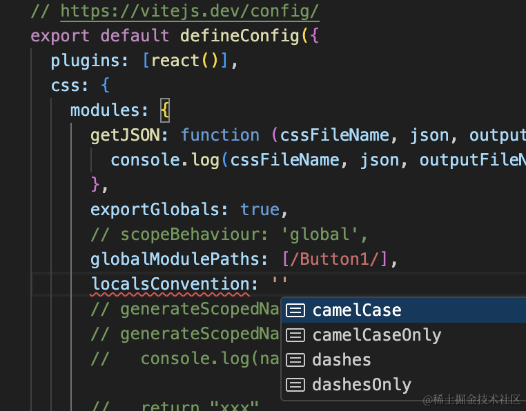
当 localsConvention 改为 camelCase 的时候,导出对象的 key 会变成驼峰的:
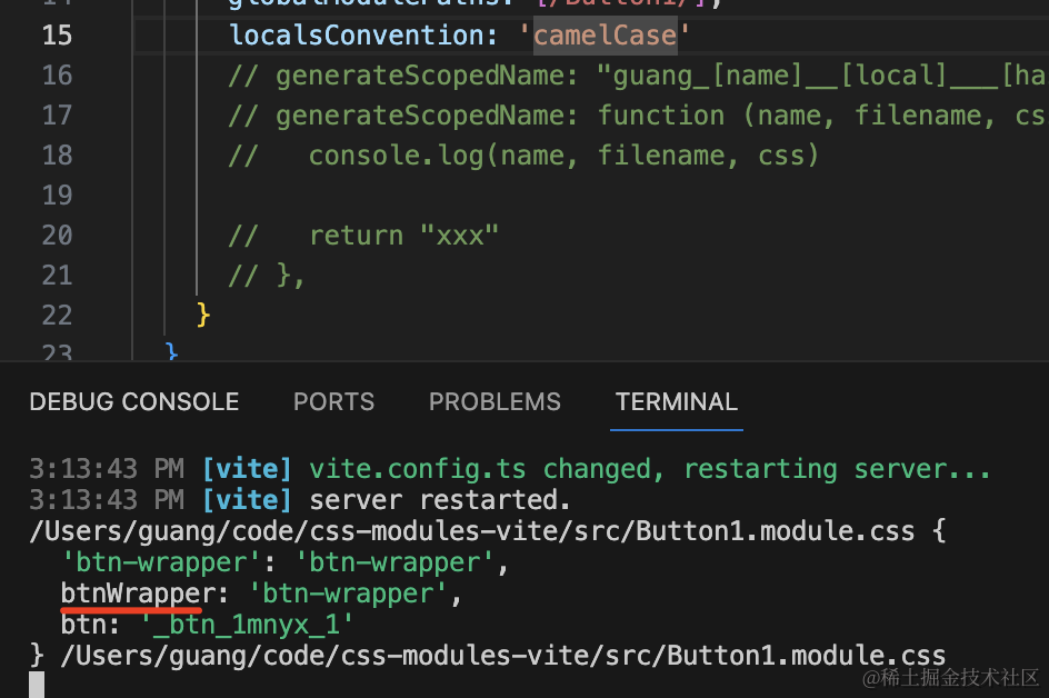
那在组件里就可以这样写:
tailwind
tailwind有两个版本:v3和v4
v4安装
vite脚手架
第一步:安装
1
| npm install tailwindcss @tailwindcss/vite
|
第二步:配置
打开vite.config.ts
修改成如下配置:
1
2
3
4
5
6
7
8
| import { defineConfig } from "vite";
import react from "@vitejs/plugin-react";
import tailwindcss from "@tailwindcss/vite";
export default defineConfig({
plugins: [react(), tailwindcss()],
});
|
第三步:引用
在你使用的css文件顶部添加下列语句:
完成
修改默认值
Tailwind CSS v4 移除 tailwindcss.config.js 后如何配置并进行主题切换在 Tailw - 掘金
Theme variables - Core concepts - Tailwind CSS
在v3中我们是这样子修改默认值的:

在v4中,我们直接在css文件中:
1
2
3
4
| @theme {
--padding-1: '30px';
--fontSize-base: ['30px', '2rem'];
}
|
v3安装
第一步:安装
我们通过 crerate-react-app 创建一个 react 项目:
1
| npx create-react-app tailwind-test
|
然后进入 tailwind-test 目录,执行
1
2
3
| npm install -D tailwindcss@3
npx tailwindcss init
|
报错处理
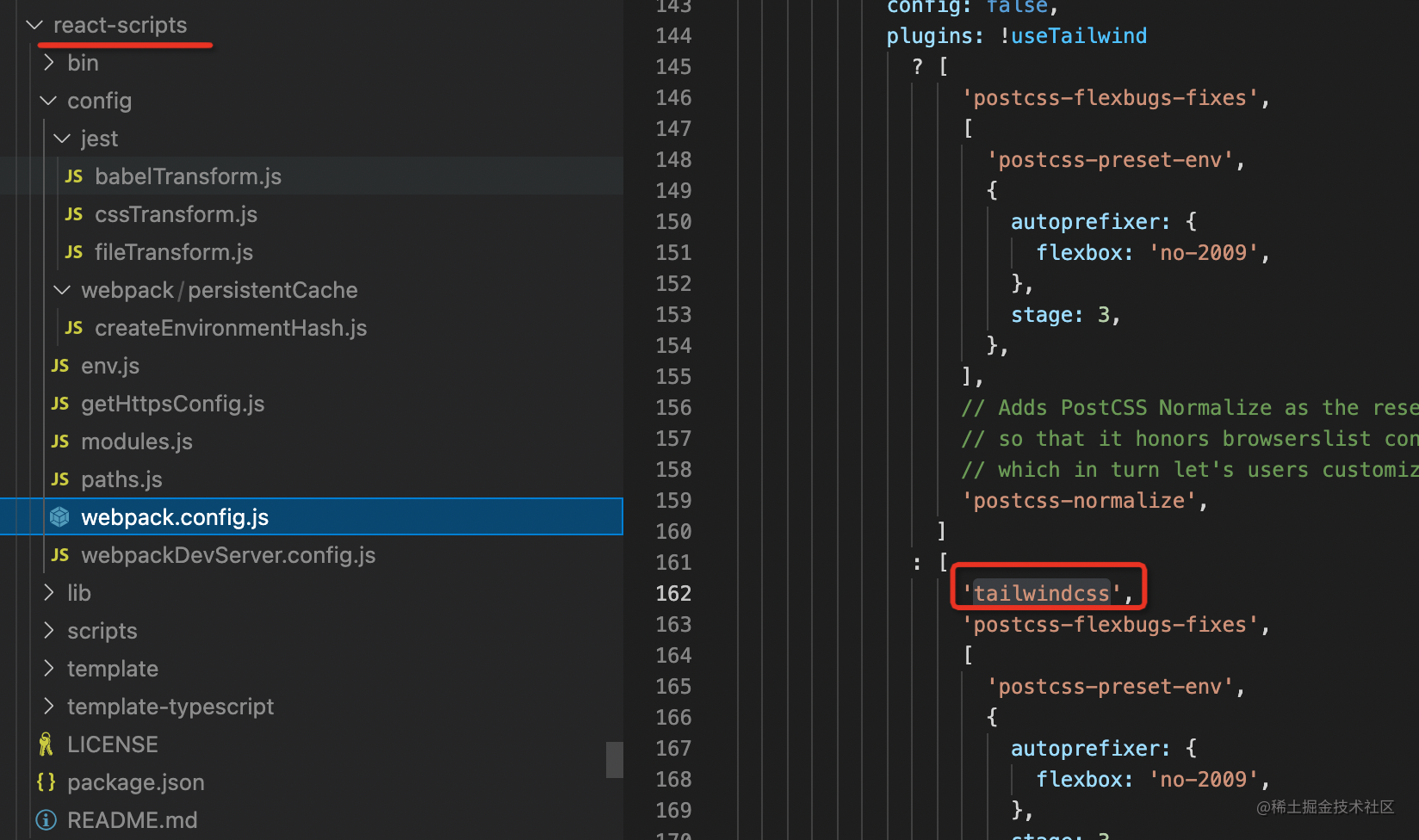
如果安装报错,将package.json改为下面的配置
1
2
3
4
5
6
7
8
9
10
11
12
13
14
15
16
17
18
19
20
21
22
23
24
25
26
27
28
29
30
31
32
33
34
35
36
37
38
39
40
41
42
| {
"name": "tailwind-test",
"version": "0.1.0",
"private": true,
"dependencies": {
"@testing-library/jest-dom": "^5.16.5",
"@testing-library/react": "^13.4.0",
"@testing-library/user-event": "^13.5.0",
"react": "^18.2.0",
"react-dom": "^18.2.0",
"react-scripts": "5.0.1",
"web-vitals": "^2.1.4"
},
"scripts": {
"start": "react-scripts start",
"build": "react-scripts build",
"test": "react-scripts test",
"eject": "react-scripts eject"
},
"eslintConfig": {
"extends": [
"react-app",
"react-app/jest"
]
},
"browserslist": {
"production": [
">0.2%",
"not dead",
"not op_mini all"
],
"development": [
"last 1 chrome version",
"last 1 firefox version",
"last 1 safari version"
]
},
"devDependencies": {
"tailwindcss": "^3.3.2"
}
}
|
有时候报错是因为main.js当中的引用了./index.css,注释掉就好了
第二步:配置
安装 tailwindcss 依赖,创建 tailwindcss 配置文件。
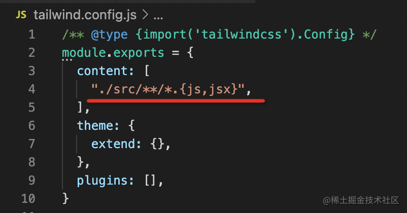
tailwind 实际上是一个 postcss 插件,因为 cra 内部已经做了 postcss 集成 tailwind 插件的配置,这一步就不用做了:
第三部:引用
然后在入口 css 里加上这三行代码:
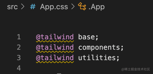
这三行分别是引入 tailwind 的基础样式、组件样式、工具样式的。
之后就可以在组件里用 tailwind 提供的 class 了
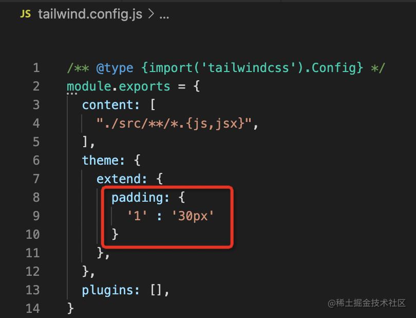
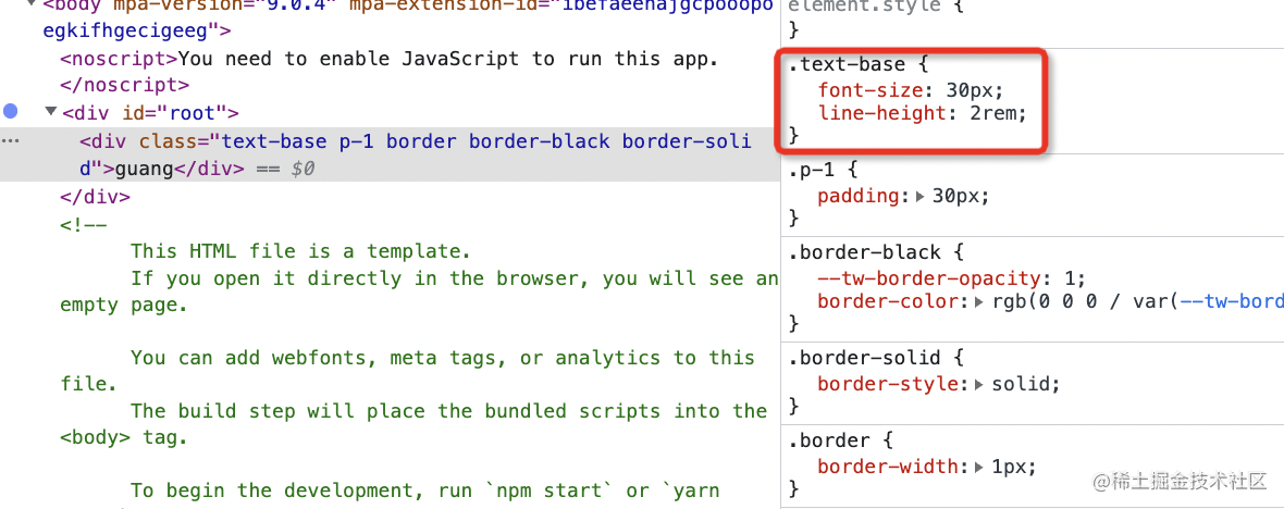
修改默认值
p-1 是 padding:0.25rem
你可以在配置文件里修改tailwind的默认值:
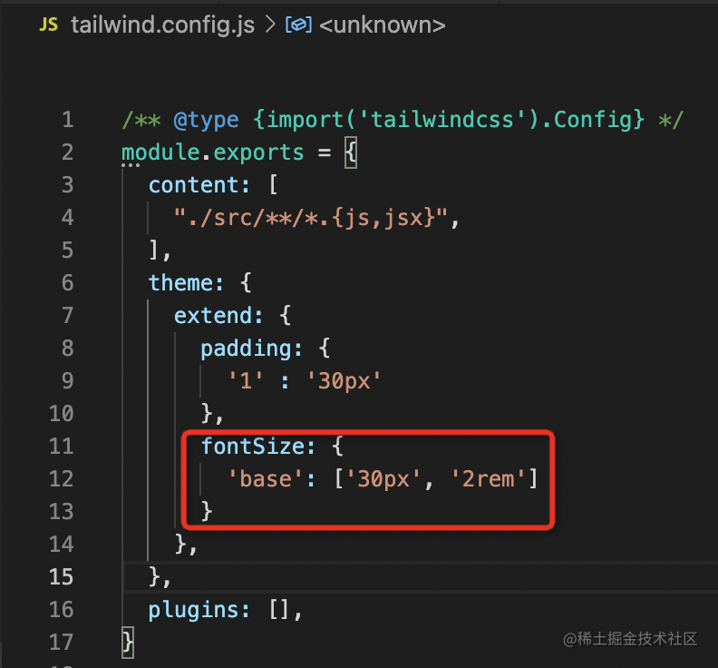
.text-base 是 font-size、line-height 两个样式,这种通过数组配置:
使用
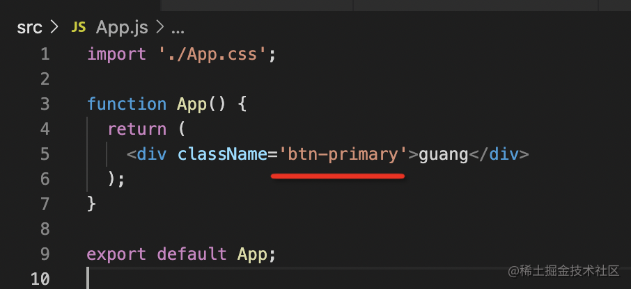
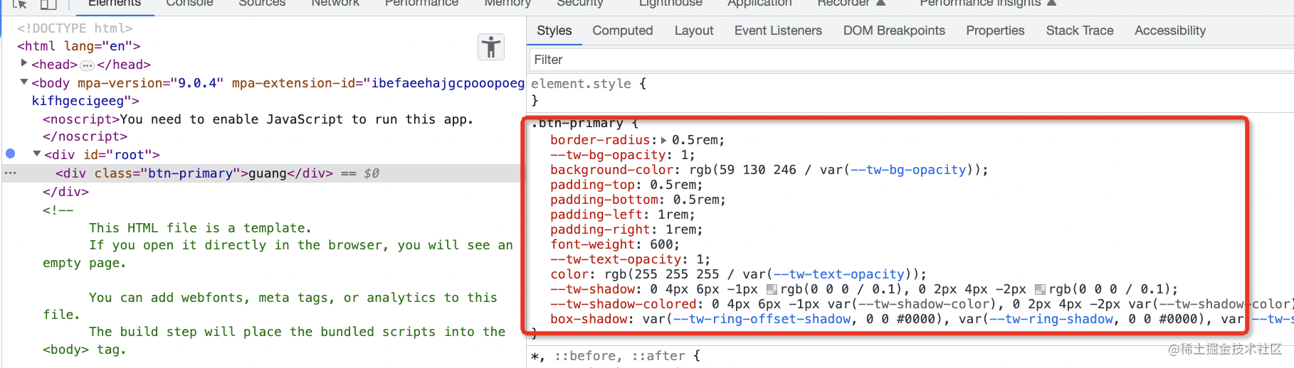
例子一
1
2
3
4
5
6
7
8
9
10
11
12
13
14
15
16
17
18
19
20
21
22
23
24
25
26
27
28
29
30
31
32
33
34
35
36
37
38
39
40
41
42
43
44
45
46
47
48
49
50
51
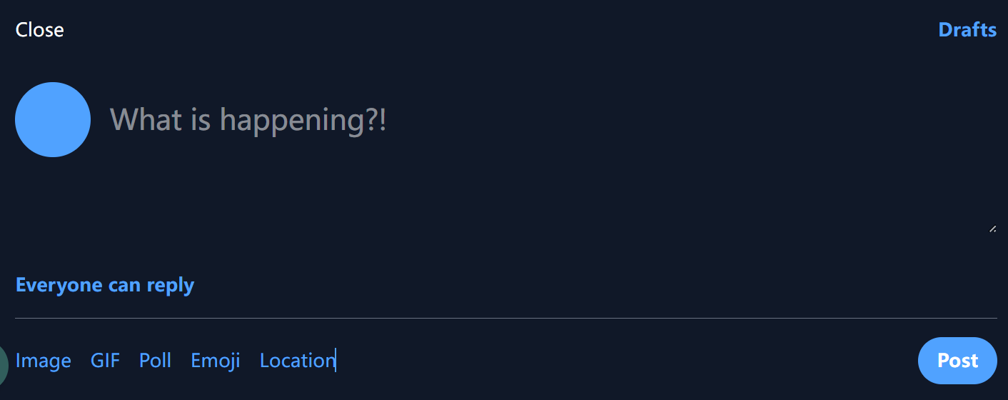
| import "./App.css";
function App() {
return (
<section className="bg-gray-900 w-full p-4">
{/* 背景为深灰色,宽度占满父容器,内边距为16px */}
<div className="flex justify-between">
{/* 使用Flexbox布局,左右两端对齐 */}
<p className="text-white">Close</p>
{/* 文本颜色为白色 */}
<p className="text-blue-400 font-semibold">Drafts</p>
{/* 浅蓝色字体,字体加粗 */}
</div>
<div className="flex gap-4 py-8 h-48">
{/* 使用Flexbox布局,子元素间距16px,上下(y轴)内边距32px,高度192px */}
<div className="w-16 h-16 aspect-square bg-blue-400 rounded-full"></div>
{/* 正方形(宽高64px),浅蓝色背景,完全圆角 */}
<textarea
className="w-full mt-4 bg-transparent text-white text-2xl focus:outline-none"
placeholder="What is happening?!"
></textarea>
{/* 宽度100%,顶部外边距16px,透明背景,白色文字,大字体,移除聚焦高亮 */}
</div>
<p className="font-bold text-blue-400">Everyone can reply</p>
{/* 加粗字体,浅蓝色文字 */}
<hr className="border-gray-500 my-4" />
{/* 灰色边框的水平线,上下外边距16px */}
<nav className="flex items-center justify-between">
{/* 使用Flexbox布局,子元素垂直居中,两端对齐 */}
<div className="flex gap-4 text-blue-400">
{/* 使用Flexbox布局,子元素水平间距16px,浅蓝色文字 */}
<p>Image</p>
<p>GIF</p>
<p>Poll</p>
<p>Emoji</p>
<p>Location</p>
</div>
<button className="text-white bg-blue-400 px-4 py-2 rounded-full font-bold">
Post
</button>
{/* 白色文字,浅蓝色背景,水平内边距16px,垂直内边距8px,完全圆角,字体加粗 */}
</nav>
</section>
);
}
export default App;
|
例子二
1
2
3
4
5
6
7
8
9
10
11
12
13
14
15
16
17
18
19
20
21
22
23
24
25
26
27
28
29
30
31
32
33
34
35
36
37
38
39
40
41
42
43
44
45
46
47
48
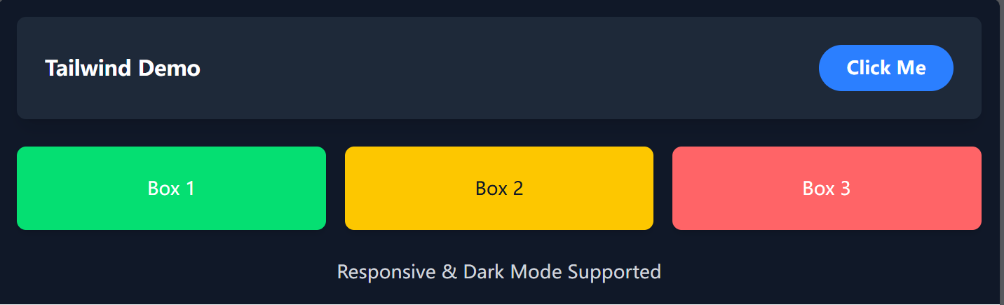
| import "./App.css";
const App = () => {
return (
<section className="bg-gray-900 w-full p-4">
{/* 背景为深灰色,宽度占满父容器,内边距16px */}
<div className="flex flex-col md:flex-row justify-between items-center gap-4 p-6 bg-gray-800 rounded-lg shadow-lg">
{/* 响应式Flexbox布局:小屏幕垂直排列,大屏幕水平排列 */}
{/* 两端对齐,居中对齐,间距24px,背景灰色,圆角,添加阴影 */}
<p className="text-white text-lg font-bold">Tailwind Demo</p>
{/* 文字白色,大号字体,加粗 */}
<button className="text-white bg-blue-500 px-6 py-2 rounded-full font-semibold transition duration-300 ease-in-out transform hover:scale-105 focus:ring focus:ring-blue-300">
Click Me
</button>
{/* 白色文字,蓝色背景,圆角,过渡动画,悬停时放大,聚焦时有蓝色光晕 */}
</div>
<div className="grid grid-cols-1 md:grid-cols-3 gap-4 mt-6">
{/* 网格布局:小屏幕单列,大屏幕三列,间距16px,顶部外边距24px */}
<div className="bg-green-400 text-white p-6 rounded-lg shadow-md text-center">
Box 1
</div>
{/* 绿色背景,白色文字,内边距24px,圆角,阴影,文本居中 */}
<div className="bg-yellow-400 text-gray-900 p-6 rounded-lg shadow-md text-center">
Box 2
</div>
{/* 黄色背景,深灰文字,内边距24px,圆角,阴影,文本居中 */}
<div className="bg-red-400 text-white p-6 rounded-lg shadow-md text-center">
Box 3
</div>
{/* 红色背景,白色文字,内边距24px,圆角,阴影,文本居中 */}
</div>
<p className="mt-6 text-center text-gray-400 dark:text-gray-300">
Responsive & Dark Mode Supported
</p>
{/* 顶部外边距24px,文本居中,默认浅灰色,在深色模式下变为稍亮的灰色 */}
</section>
);
};
export default App;
|
基本语法
Border Width - TailwindCSS中文文档 | TailwindCSS中文网
📌 基本用法列表
- 实用类(Utility Classes)
- 布局(Flex/Grid)
- 间距(Margin/Padding)
- 尺寸(Width/Height)
- 文本样式(Typography)
- 背景(Background)
- 边框(Borders & Radius)
- 伪类(Hover、Focus 等)
- 状态变体(Dark Mode、Active 等)
- 动画(Transitions & Animations)
- 响应式设计(Responsive Design)
- 复用样式(@apply & 自定义主题)
2️⃣ 实用类(Utility Classes)
Tailwind 提供了大量的类来快速开发,比如:
1
2
3
| <div class="text-center text-lg font-bold text-blue-500">
Hello Tailwind!
</div>
|
text-center → 文本居中text-lg → 字体大小 lgfont-bold → 加粗text-blue-500 → 颜色 blue-500
3️⃣ 布局(Flex/Grid)
✅ 使用 Flexbox
1
2
3
| <div class="flex items-center justify-center h-screen">
<p>居中对齐</p>
</div>
|
flex → 启用 display: flexitems-center → 垂直居中 (align-items: center)justify-center → 水平居中 (justify-content: center)h-screen → 高度 100vh
✅ 使用 Grid
1
2
3
4
5
| <div class="grid grid-cols-3 gap-4">
<div class="bg-red-300">1</div>
<div class="bg-green-300">2</div>
<div class="bg-blue-300">3</div>
</div>
|
grid → 启用 display: gridgrid-cols-3 → 三列gap-4 → 间距 1rem
4️⃣ 间距(Margin/Padding)
1
2
3
| <div class="m-4 p-6">
Margin 4, Padding 6
</div>
|
m-4 → 外边距 1remp-6 → 内边距 1.5rem
更精细的控制
1
2
3
| <div class="mt-2 mb-4 ml-6 mr-8">
四个方向的 Margin
</div>
|
mt-2 → 顶部 margin 0.5remmb-4 → 底部 margin 1remml-6 → 左侧 margin 1.5remmr-8 → 右侧 margin 2rem
5️⃣ 尺寸(Width/Height)
1
2
3
| <div class="w-32 h-16 bg-gray-300">
宽 8rem, 高 4rem
</div>
|
w-32 → 宽度 8remh-16 → 高度 4rem
6️⃣ 文本样式(Typography)
1
2
3
| <p class="text-xl font-semibold italic underline">
大号加粗斜体带下划线
</p>
|
text-xl → 字体大小 1.25remfont-semibold → 半粗italic → 斜体underline → 下划线
7️⃣ 背景(Background)
1
2
3
| <div class="bg-gradient-to-r from-blue-400 to-purple-600">
渐变背景
</div>
|
bg-gradient-to-r → 线性渐变from-blue-400 → 起点颜色 blue-400to-purple-600 → 终点颜色 purple-600
8️⃣ 边框(Borders & Radius)
1
2
3
| <div class="border border-red-500 rounded-lg p-4">
圆角 + 边框
</div>
|
border → 默认 1px 边框border-red-500 → 红色边框rounded-lg → 圆角 0.5remp-4 → 内边距 1rem
9️⃣ 伪类(Hover、Focus 等)
1
2
3
| <button class="bg-blue-500 hover:bg-blue-700 text-white font-bold py-2 px-4 rounded">
Hover 我
</button>
|
hover:bg-blue-700 → 悬停时变深色text-white → 白色文本py-2 px-4 → 适当的内边距
🔟 状态变体(Dark Mode、Active)
1
2
3
| <div class="dark:bg-gray-800 dark:text-white">
Dark Mode 下生效
</div>
|
dark:bg-gray-800 → 深色模式背景 gray-800dark:text-white → 深色模式文本白色
1️⃣1️⃣ 动画(Transitions & Animations)
1
2
3
| <div class="transition duration-300 ease-in-out transform hover:scale-110">
悬停放大
</div>
|
transition → 过渡动画duration-300 → 300ms 过渡ease-in-out → 缓动函数transform hover:scale-110 → 悬停时放大 1.1 倍
1️⃣2️⃣ 响应式设计(Responsive Design)
1
2
3
| <div class="text-base sm:text-lg md:text-xl lg:text-2xl xl:text-3xl">
根据屏幕大小调整字体大小
</div>
|
sm:text-lg → 小屏幕时 lg 大小md:text-xl → 中等屏幕时 xl 大小lg:text-2xl → 大屏幕时 2xl 大小xl:text-3xl → 超大屏幕时 3xl 大小
1️⃣3️⃣ 复用样式(@apply & 自定义主题)
在 globals.css 中:
1
2
3
4
5
6
7
8
9
| @tailwind base;
@tailwind components;
@tailwind utilities;
@layer components {
.btn {
@apply bg-blue-500 text-white py-2 px-4 rounded hover:bg-blue-700;
}
}
|
然后 HTML 中使用:
1
| <button class="btn">按钮</button>
|
🎯 结论
- Tailwind = CSS 变量 + 工具类
- 高效开发,避免手写 CSS
- 推荐搭配
@apply 自定义组件
- 适用于响应式设计、主题定制、动画等
🚀 快去试试 Tailwind CSS,让你的开发速度起飞吧! 🎨✨
常见问题
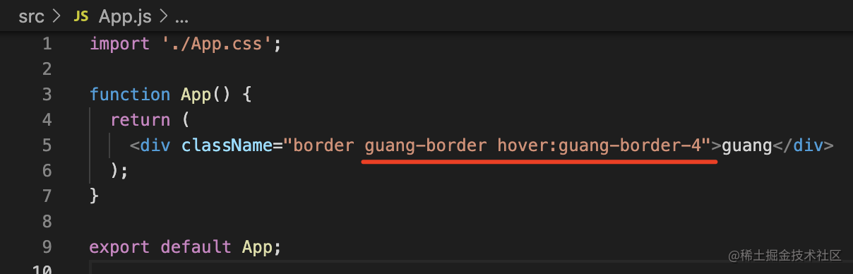
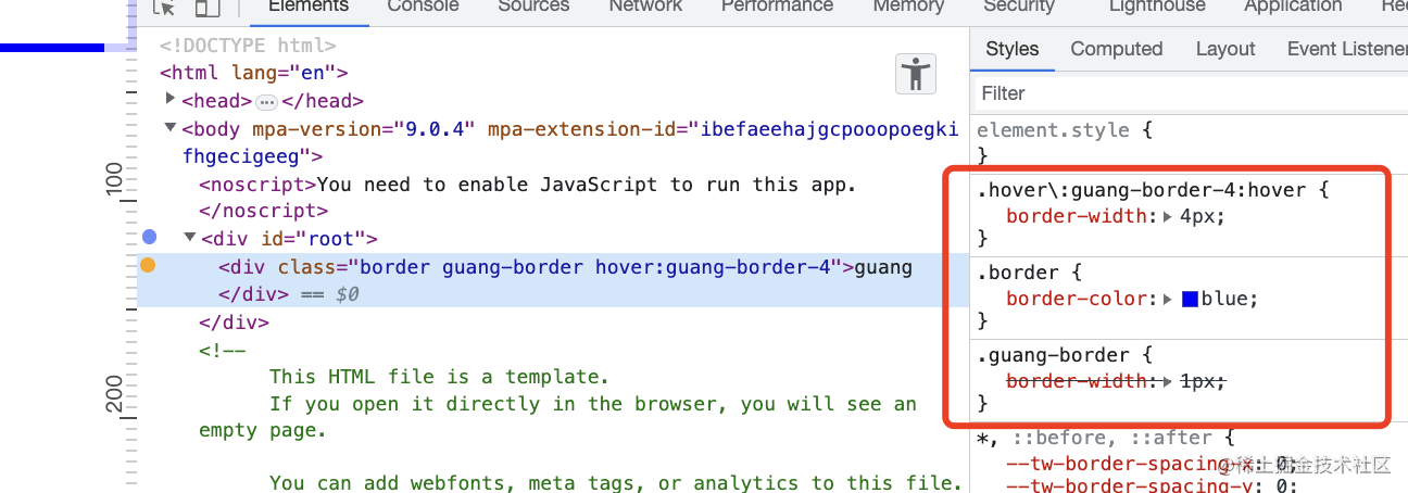
命名冲突(v3)
我本来有个 border 的 class:
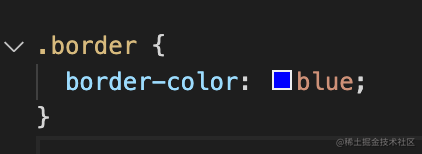
而 tailwind 也有,不就冲突了么?
这个可以通过加 prefix 解决:
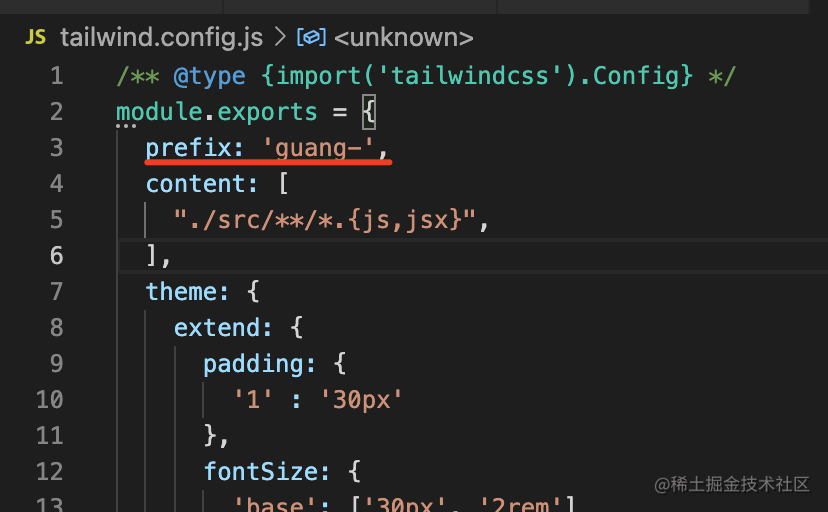
不过这样所有的原子 class 都得加 prefix 了:
类型太长了如何处理
类型太长了而且重复多次
这种问题可以用 @layer @apply 指令来扩展:
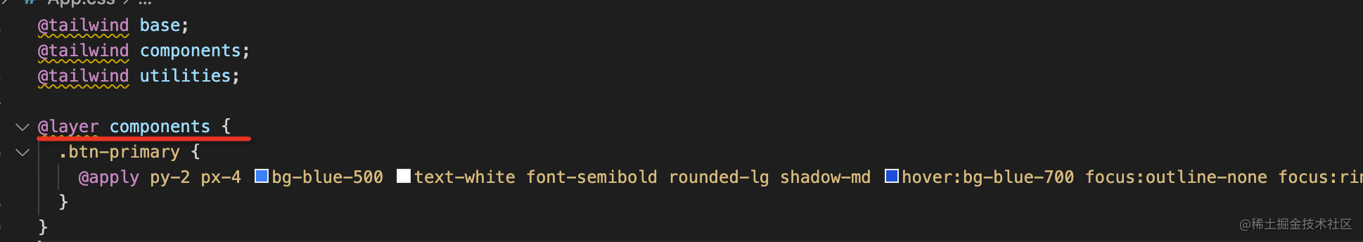
前面讲过 @tailwind 是引入不同的样式的,而 @layer 就是在某一层样式做修改和扩充,里面可以用 @apply 应用其他样式。
效果是这样的: